A Small Space That’s Big on Style
Despite the small square footage, Susan Durling of Susan Durling Designs created a combined kitchen and living space that doesn’t feel cramped or cluttered.
Make the most of limited square footage with intentional design.
Living in New Hampshire—especially for those who call coveted areas like Portsmouth home—often means learning how to fit your lifestyle into a small space. It can be tedious to learn how to navigate the often-compact layout and shape of traditional New England Cape Cod or Colonial-style homes, but kitchen and interior designer Susan Durling, of Susan Durling Designs, says it doesn’t have to be. “I have found that a lot of New England homeowners get nervous about redoing their homes because of the small spaces within that they feel confined to,” Durling says.
“Whatever you lack in square footage—whether that’s in the kitchen, living room or other shared spaces—you can make up for with smart, intentional design.”
Durling’s creativity shines in a combined kitchen and living space she designed for a couple who were looking for a space with greater functionality for their family of four. The family imagined being able to walk between rooms with ease, and creating a space that honored the home’s originality and charm with a more modern twist.
During the renovation, Durling focused on enhancing the space she was given without knocking down walls or changing windows, and making sure that one room transitioned smoothly into the next. Her first order of business? Cabinetry. “When you’re working with an older, quaint home, maximizing vertical storage space is a crucial component to bringing functionality and practicality to a space,” she says.
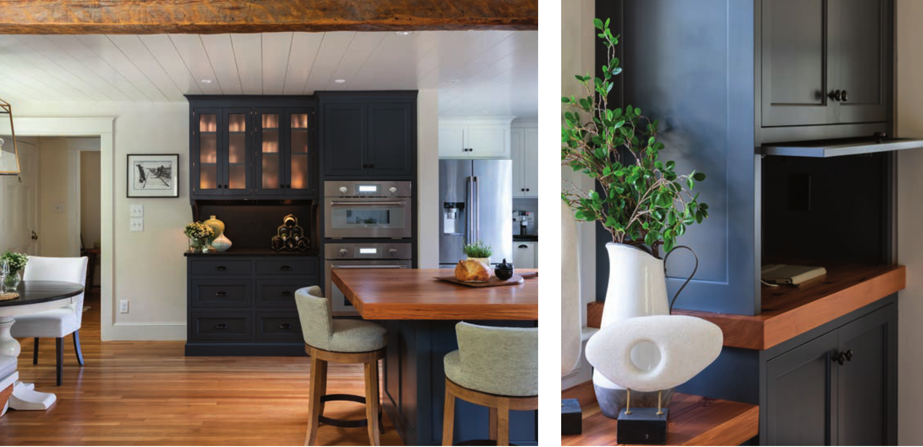
White cabinets add a traditional element to the kitchen, while the dark, charcoal gray Durling recommended on the center island and cabinets around the living area adds a sense of depth.
“Contrary to what many people would think, adding darker colors in moderation actually make smaller spaces appear larger,” Durling says. “The gray tones down and grounds the white cabinets, while also making the surrounding walls look like they are receding. If your space gets a lot of natural light, adding a darker color like this one can be beautiful and even dramatic.”

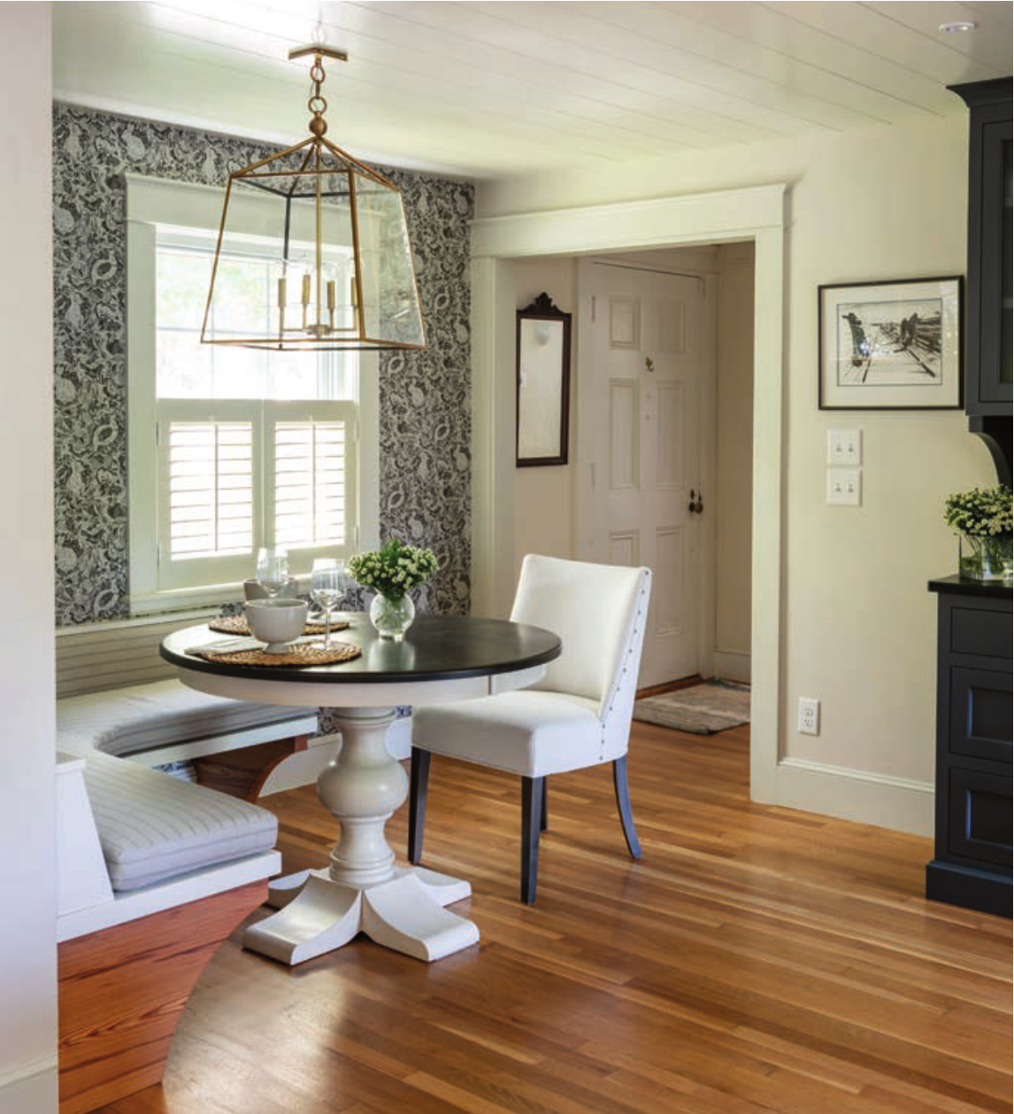
Top: The storage provided by the custom cabinets by Matt Janousek of MJ Cabinets was a key part of the design. Above: A round table in the dinette maximizes space, and the bold wallpaper adds visual interest. Matt Janousek, of MJ Cabinets, built the cabinets from scratch using reclaimed materials. “Our goal from the beginning was to make sure the cabinets were easy to maintain, were user-friendly and created a sense of balance,” Janousek says.
Lighting was added into the accent cabinets to stand out and add warmth to the area, without adding more clutter in the house. “Lighting can make or break a space,” Durling says. “The key is to make sure you are integrating a good balance of decorative and task lighting without adding so much that it feels like you’re weighing the room down. Choosing features like the light fixture above the dinette is also a way to incorporate a statement piece that doubles as a small work of art.”
Looking for ways to add texture through furniture and materials can bring a space alive. “We used lighter colors in larger pieces, like the living room couch, to create a harmonious feel between both rooms,” Durling says. “We also played up the patterns and textures in the throw pillows and rug to complement the roughness of the textures in the exposed kitchen beam and natural floors. All the elements together aim to soften the hard edges in the home while keeping it open.”
Making good use of modern, transitional details was a big part of the homeowner’s vision and was even more important in the dinette design. The corner where the dinette was built is tight, so Durling recommended a round table to maximize seating around the banquette that Janousek built. “We used the same fir-wood material from the countertops, which ties the space together,” Janousek says.

Extra design details—like the blackand-white wallpaper and bench cushion fabric from the Weekender House in Portsmouth—brought the corner to life.
“It’s important not to over-design a small nook like this one,” Durling says. “A quick, bold pop of color or pattern is all you need to give the eye some negative space to rest and let the overall design speak for itself.”
Another charming detail is the open shelving around the window over the sink. “It really gives the eye a little relief from a wall of cabinetry,” Durling says.
In order to tie the three living spaces together, Durling used nickel gap on the ceiling that is consistent with the age of the house. It was one of the elements of the design that she showed the homeowner on the 3D software she uses for all her designs. “I’ve found the software is tremendously helpful for homeowners to visualize their kitchen. I can change colors, fixtures, cabinet designs and even furniture. The homeowner can virtually stand in their future kitchen and get a complete 360-degree perspective. They love it!”
In addition to offering clever storage options, the cabinets help make the space feel bigger. Contrary to popular opinion, says Durling, using darker colors in moderation can actually help rooms seem larger than they are.
The last design touch was the 20-footlong reclaimed beam that was added between the kitchen and living room to tie both rooms together and give interest.
The final result? A petite dwelling that maximizes space without sacrificing style.
“This project exemplifies that small-space design doesn’t have to become more of a project than it already is,” Durling says.
“It’s a perfect unity of the function and tranquility that echoes throughout the rest of the home.”
RESOURCES
MJ Cabinets • mjcabinets.com
Susan Durling Designs • susandurlingdesigns.com
Weekender House • weekenderhouse.com