Textile Transformations
Natural fabrics become twoand threedimensional works of art in Jane Balshaw’s studio.
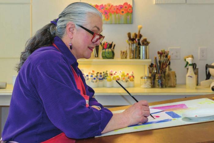
In her Canterbury studio,
Jane Balshaw paints a floral prototype for a chair seat cover at the
desk her mother once used for her airbrushing work.
What makes a painting, a sculpture, a building or a graphic design pleasing to the eye? Proportion, balance and color are three components that come into play—and they are the foundation of painter, fiber artist and colorist Jane Balshaw’s work.
Based in Canterbury, Balshaw has been a juried member of the League of New Hampshire Craftsmen since she moved here from California in 2003. Several of her pieces are scheduled to be on display in Art, Craft & Design: The Exhibition at this year’s craftsmen’s fair (see page 84 for more information).
The league also calls upon Balshaw for other reasons—with her background in interior design, she has
helped the league with layout and display in its galleries throughout
the state, including the newly designed smaller shop in Hooksett.
But
Balshaw’s heart is in her studio, and she’s had commissions from
homeowners, business owners and institutional clients throughout the
state—and beyond. She was on the homestretch of renovating her studio
when we spoke this spring.
New Hampshire Home [NHH]: How did you find your way to the art world?
Jane Balshaw [JB]: I
grew up in California where both my parents were artists. My father was
a portrait photographer who had a lab in the house, and he also did
lithography. My mother was an airbrush
artist in San Francisco, who did work for Saks and Bergdorf-Goodman.
Later in life, she became an oil painter and a Chinese brush painter. My
mother’s sister, Nell Melcher, was an internationally known
watercolorist—their mother was a watercolorist and their father was a
sign painter. So I was exposed to art early.
NHH: Did you study art in college?
JB: I
did not have a formal art education, but I did study interior design
and fashion analysis in college. I was always interested in how we
understand proportion and balance in the world around us. That’s how I
became interested in the golden ratio [also known as the divine
proportion, the golden ratio is a mathematical concept that goes back to
the ancient Greeks; the ratio is approximately 1:1.618 and appears in
geometry, art, architecture and other areas]. There is a natural and
mathematical proportion in the world around us. We see it in the ratio
of the length of our fingers to the length of our arms, in the design of
the Parthenon and in Leonardo da Vinci’s drawing of the Vitruvian man,
which represents the beauty and symmetry of the human frame as well as
the divine connection between the human form and the universe.
Proportion and balance are also used in clothing design, such as
determining the best hemline based on the body type of the person
wearing the dress.
NHH: How has your interest in the golden ratio affected your work?
JB: I
figured out that you could apply the same ideas concerning proportion
and balance to color so the finished work has harmony. I use Fibonacci’s
number sequence to blend my paint and proportion my artwork. This
number sequence was introduced to Western Europe in 1202 by the Italian
mathematician Fibonacci—also known as Leonardo Bonacci or
Leonardo of Pisa—to relate to the golden ratio. The sum of two
consecutive numbers in the sequence equals the next number— for example
1, 1, 2, 3, 5, 8, 13, 21 and so forth to infinity. The relationship
between each sequence is that of the golden ratio, which is the perfect
balance we see in the natural world around us. Examples of Fibonacci
numbers appear in biological settings, such as the arrangement of leaves
on a stem, the flowering of an artichoke and an uncurling fern. I
believe using this balance allows the viewer of my artwork to feel
engaged and satisfied.
NHH: What’s your methodology?
JB: I use three primary color wheels in my work. One wheel is tinted red—primary red, reddish yellow
and reddish blue. A second has primary yellow, yellowish red and
yellowish blue. The third is primary blue with bluish yellow and bluish
red.
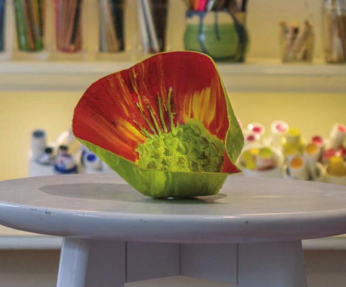
Above: Jane Balshaw’s Red Botanica Vessel is sculpted and stitched canvas painted with acrylic.
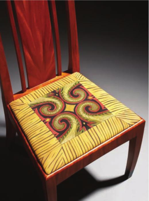
Top:
For this chair made by New Hampshire Furniture Master Tom McLaughlin,
Jane Balshaw made the seat covering from painted and stitched cotton.
I mix my own paints and have everything in my studio organized according to these systems of color. For example, when I designed the
upholstery for chairs by New Hampshire Furniture Masters Tom McLaughlin
and Jeffrey Cooper [see page 81], I chose colors for my fabric that
complemented the reddish brown color of the wood.
NHH: So the colors in your fabric come from paint and not from how the fabric was dyed or woven?
JB: That’s
correct. Painted fabrics don’t fade, and they hold up better than dyed
fabrics. The paint is acrylic, which makes it stain-resistant. Anything
that gets on the fabric does not penetrate. To clean it, I just use cool
water on a cloth.
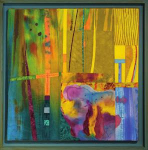
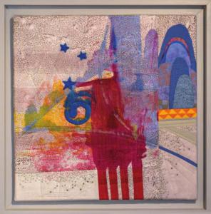
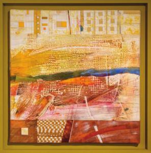
Examples
of Jane Balshaw’s monotypes on cotton include, clockwise from top left,
Crossing Over, which is stitched, appliquéd and hand quilted; Purple
Mountain Majesty, which is stitched and quilted; Hope Springs Eternal,
which is quilted and embellished with painted and sculpted cotton; and
Aggregate, which is stitched and quilted.
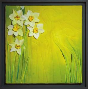
My
wall art is also painted. I use natural fabrics—I prefer cotton but
have used silk—as the colors become more entwined rather than laying on
top as they would on synthetics.
NHH: Some of your pieces look like they’re quilted.
JB: Quilting
is a passion of mine. I learned how to sew in the fifth grade and made
my own clothing. For me, quilting is a mix of my color world with
sewing. Every textile piece I do could be considered a quilt, if you
define that as layers of fabric held together by thread. But you are not
confined to using only textiles. I’ve used molded felt and paper.
NHH: What are you working on now?
JB: I’m
enjoying painting botanical vessels, which are made from canvas fabric
that I cut, restitch and then sculpt into shape. Then I use a few layers
of gesso to prime the fabrics, embellish them with hot glue and paint
with my acrylic paint. I use colors that fit into what I call my triadic
color theory system.
NHH: What’s the best part of your work?
JB: I
like the analytical part of the design process—designing shape and
determining color, and then pulling it all together from my mind’s eye
and seeing it work. NHH
See the Work of New Hampshire’s Finest Craftspeople!
Because
of the pandemic this summer, the League of New Hampshire Craftsmen’s
eightyeighth annual fair August 1–9 will be a virtual event at
nhcrafts.org. As one of the premier craft shows nationwide, the fair
showcases work by some of the finest juried craftspeople in the country.
See
and shop for one-of-a-kind fine craft that is both beautiful and
functional. In addition to the not-to-be-missed Art, Craft & Design:
The Exhibition, where you can see Jane Balshaw’s work, you can connect
with the hundreds of makers, and learn about their vision and passion
for their craft—all from the comfort of your home!
Highlights of the fair include:
• Shopping directly from league members
• Daily craft demonstrations that stream online
• Workshops by craftspeople that are provided as webinars
The 2020 League of New Hampshire Craftsmen’s Annual Fair Saturday, August 1–Sunday, August 9 Online for 2020 at nhcrafts.org
RESOURCES
Jane Balshaw • (603) 491-7305 janebalshaw.com
League of New Hampshire Craftsmen (603) 224-3375 • nhcrafts.org